Animation for Clients - Week 7
- Em New

- Nov 6, 2021
- 3 min read
This week I've been responding to feedback from our practise pitches, which has mostly involved making some small changes to the animatic - making the setting of school and Pansy's strength more obvious.

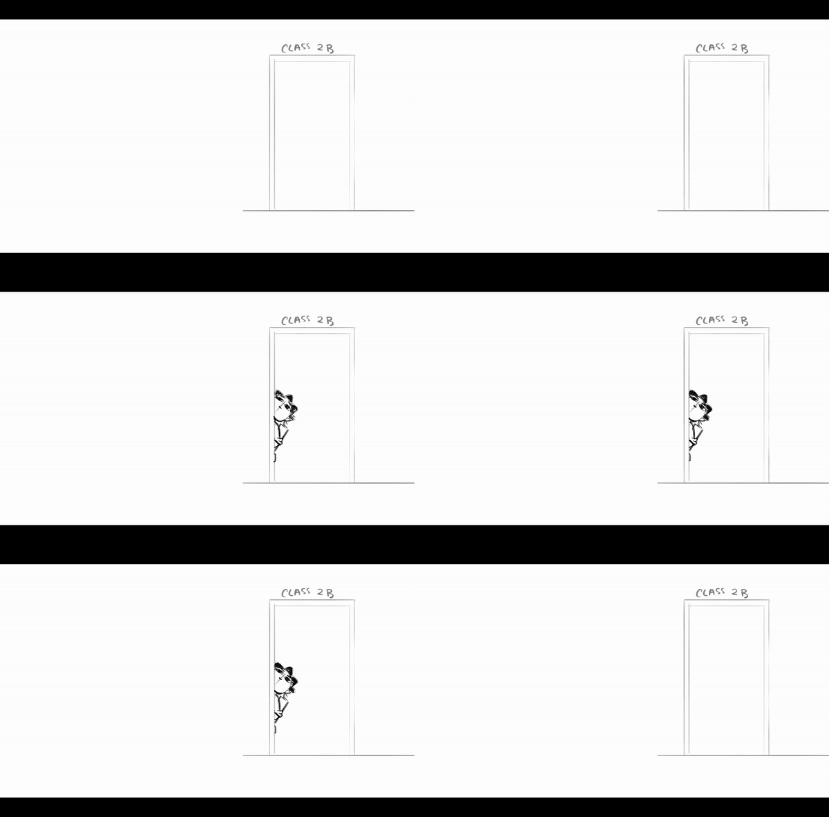
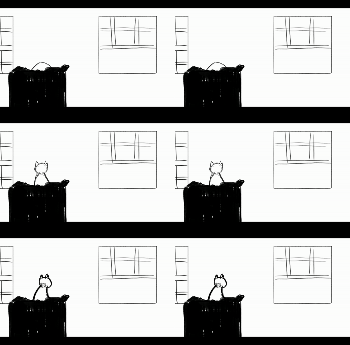
This is my messy storyboard planning out what to add to the animatic. there's an establishing shot of the school and a plan of how Pansy picks up the bookshelf while the cat is on it to shake it from its spot. This movement is partially inspired by the way Mr. Incredible shakes the tree with the cat in at the beginning of The Incredibles.
Other than this I've made a couple other changes, like Pansy's outfit. I decided that the grey was a little too bland to stand out from the background much, plus Dodge cat's black fur doesn't stand out from it much when they are next to each other, so I changed her to be out of her blazer and in a red school jumper. To further deal with making her pop out from the background I changed the style I was drawing them in. I think they look good little line work, meaning the thick lines around Pansy's character draw the eye to her even more.
I still have lines around props and other articles that end up moving but otherwise I like the line-less look mixed with Pansy and Dodge keeping their lines.
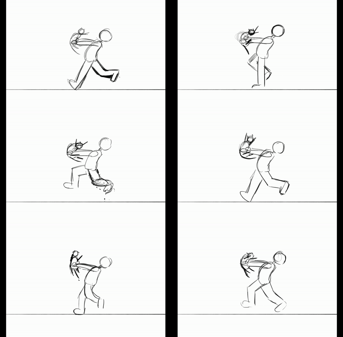
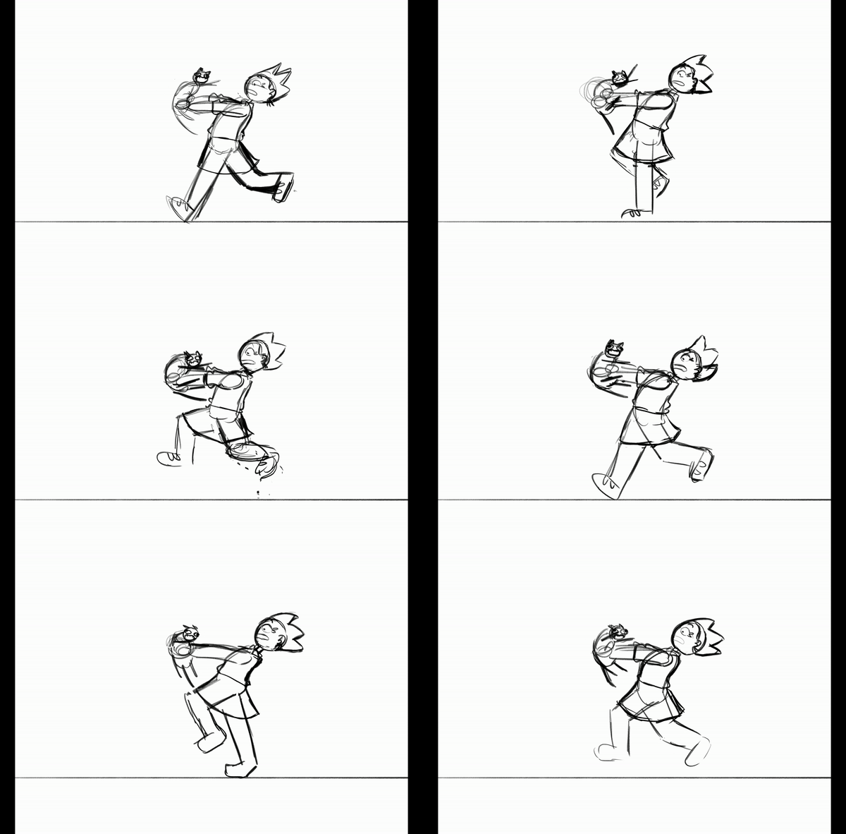
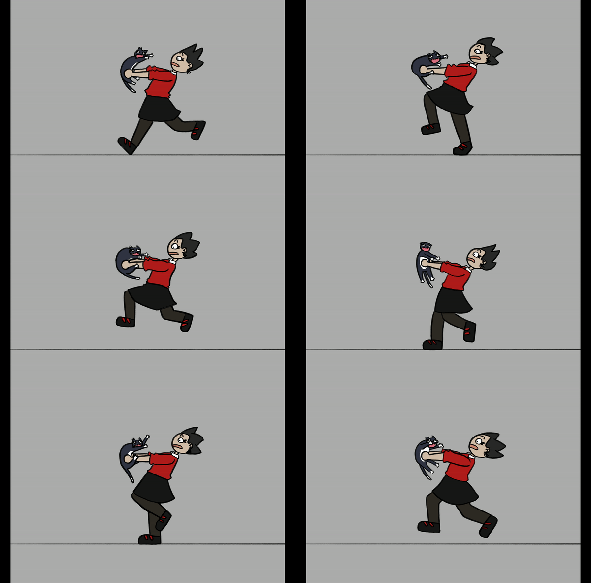
I've also made a small piece of test animation so that I can show the characters moving for the DC Thomson pitch. It's a simple run cycle, and you can see the build up of the piece below:
Dodge Cat looks a little less organised than Pansy in movement, which I will make an effort to be more detailed with when animating the final product, but for now i think his chaotic nature is well-fitted with his personality.
I have also made a simple Gantt chart looking at the ideal schedule of the project, so far I am pretty much on schedule, but I know that some shots will take longer than I expect, especially when it comes to line work and colouring. I'm leaving the backgrounds to the end of the project as I can use my plain layout work from my animatics if worst comes to worst, or simple leave them at line work without colour, which although deviates from my line-less background plan would still allow my characters to stand out from their setting.

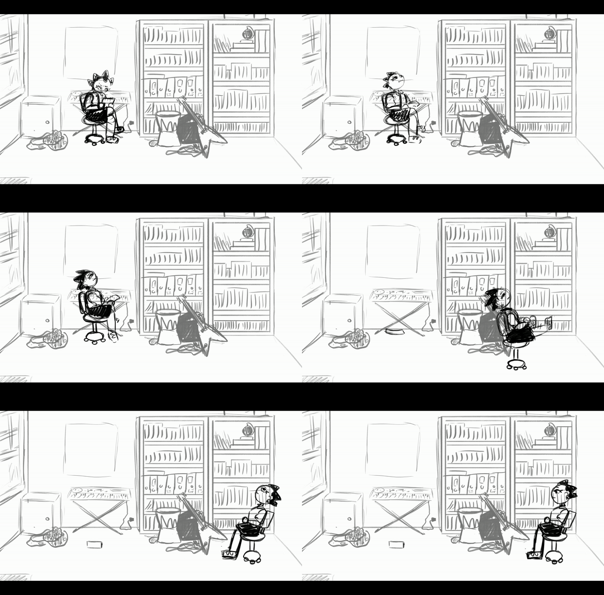
I have begun animating some roughs, getting through the first, second and fourth shot of the film. I'm saving a few shots for when I have the Donny Tam's first thoughts on the soundtrack as they'll need to be responding to what they choose to do. The third shot is one I'm leaving till then, as it is of Pansy playing the guitar, and I'd really like to play about with the pose and expression according to what Donny comes up with and how I think Pansy would play it.
Here is what i have animated in Photoshop so far:
I'm pleased with my progress so far and feel like I am gaining an understanding of how Pansy and Dodge move about their setting. I'm looking forward to getting int Dodge's movements more, having just begun keyframes on his entrance through the window. Obviously having four legs he will be difficult, but I still think he will be fun to play with. My next steps are continuing to animate my roughs, hopefully getting to get over half way through them by next week.




Comments