10x10x22
- Em New

- Mar 20, 2022
- 10 min read
10x10 is when we all create a short animated film each day for 10 days. It's not just the University of Edinburgh that do this or just animators who take part, meaning a lot of really cool stuff comes out of the 2 weeks including scores we can respond to, or re-releases of our own work with music from a composer over it. I enjoyed being in the studio for this year's 10x10, as last year we just had to make them from home. Being in the studio meant that we had a real feeling of community whilst making our work, we were all always interested in what other people were making and helping each other out, it was just really nice. I think I found it harder to get fully into creating a narrative driven animation than I did last year, but I think that might be because last year I would just wake up, make a 10x10 and then go back to sleep at the end of the day, there wasn't anything else to focus on, whereas this year I couldn't put all of my brain towards just one thing. Part of this was probably because I needed to get into the studio as the first step, and maybe sometime I got distracted by what other people were working on, but I much prefer this than being by myself in my room for the whole two weeks.
Day 1:
The first 2 days were spent working on some animated shorts for a student film I've agreed to help out on. It's mostly live-action but with stop-motion segments similar to Wes Anderson's The Grand Budapest Hotel and similar to Amelie stylistically.
The first scene I had to animate was a periscope looking through the windows of a block of flats, the model of which was made by Sam Orr and looks awesome in both of our work for the film. I made the periscope itself out of super sculpey and painted with a mixture of metallic and matt acrylic paints. I'm pretty pleased with how the animation turned out, I believe it will be cut into with different shots of the people in the windows, and colour graded by the editors of the film.
I was surprised that a composer put music to this one as I didn't think it would inspire anything, it just including inanimate objects not moving particularly interestingly or to any rhythm, but I like the music that Magdalena Demetz put to it! t adds some intrigue!
Day 2:
My day 2 was also for the film and used a rocket I had made with super sculpey travelling from one window to another. I used cotton wool to animate the smoke coming from it as it whizzed about which I really enjoyed.
Day 3:
Day 3 was the first day where I did something of my own design, and I didn't end up liking it that much but it's the only 2D drawn piece that I coloured in throughout the whole of the two weeks. I was thinking about robots because of my Issue of Representation film so wanted to do something simple with another robot. I also wanted to include a bird because I have really been enjoying listening to the birds now that they're out and about more.
Again, to my surprise, one of the composers put music to it, it's pretty sinister from the beginning and especially dramatic once the robot opens his eye but cheers up again when they smile at the bird. It's pretty cute at the end and Niklas Haverkate followed the animation's timing really well, so it's pretty cool to have for an animation I didn't think was worth anything.

Day 4:
Day 4 was when I started to get a bit more into the groove of things and used another under-the-camera method, but instead of using pre-made things I worked in claymation! It was the first claymation I've ever done and knew I wanted to create something that moved freely and morphed from one thing to another, because I always enjoy watching that sort of thing in this medium. I'm really happy with how it came out, the movements are smooth, it loops really well, and when I played about with it in After Effects I thought that the black background made it look so much cleaner. I also played with the colours a little, making them darker, and put a slight glow to the edges because I thought it fit the slightly creepy vibe of the piece.

I was really hoping someone would make some trippy sinister music to this, and it did get music put to it by Joep Verheijin, who made it way more dramatic than I thought it would be, but it's an awesome piece of music!!
Day 5:
Day 5 was the first day with a prompt, which was Ukrainian Animators. We could interpret this however we wanted, and I took it as a little research task to create something inspired by a Ukrainian animator. I watched through a few clips of different animator's work and ended up really enjoying Efrem Pruzhanskiy's Alice in Wonderland, it's a really magical version of it, the backgrounds are all done in sort of trippy watercolour or ink paintings, Alice herself is designed beautifully with big hair and a wonderful silhouette to her victorian style dress. I considered making an animation of a girl in similar attire, maybe using patterned paper as the colour fill to add a paper cut-out style to it, but instead made an actual paper cut-out animation inspired by the Cheshire Cat in the film.
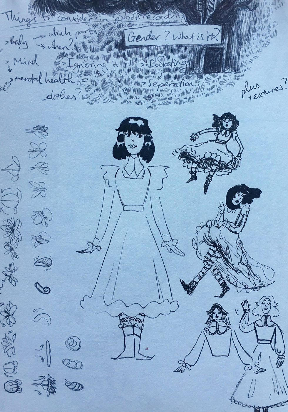
Above are some sketchbook pages from the day where I explored whether I wanted to do this girl in dress idea or the big paper cat idea. You can see on one or two of the pages I was desperately trying to think of a way I could include a Discworld character, but I couldn't think of what they would be doing, and the charm of the cat in the film was too much too resist!
(The cat appears at about 12:00)
I'm both happy and unsatisfied with this one, I like how I mimicked the style of the cat and enjoyed making him stretch like an actual cat would but I feel like it lacks soom intrigue, and I found myself wishing I had created something more like when the cat sits with his legs crossed in the film. I thought he was a really funnily animated character in Pruzhanskiy's work and would have enjoyed making a cat morph into things like a hat or a big hand, as well as animate him more like an eccentric human. I think if I had considered what I was going to animate more at the beginning of the day I could have made a really fun combination of cat and human-like movements. Despite all this, if I had made the animation any longer I probably would have lost my mind a little bit because paper cut-out animation tries my patience A LOT. It's quite a faff getting all the pieces to keep in place when trying to move another.
Enya Liao put a really cute piece of music over this one which I was flattered by, it's whimsical and light-hearted which I think matches the vibe perfectly.
Day 6:
It took me a little while to come up with an idea for my sixth day, but after some sketching I decided on a cowboy who was a wolf. I used traditional hand-drawn animation for the first time since my last film of last year, but used a very rough scribbly style which I liked using. I wanted in invert the animation to make it look like it was set at night so I added more scribbles to the base of the fire and the moon, which ended up working very well. I had wanted to make the background perfectly black, but the lighting of the filmed paper turned out to have shadows around the edge, which turned out to make a cool old film grainy look around the edges which I actually like a lot, it add character. I like this animation a lot, I like my little cowboy dude and feel like it's one that you could imagine a narrative around- how'd he get out into the middle of nowhere, what is he doing, where is he headed? I alsoo like that he's just having a good time by himself with his banjo too.
Below are the sketchbook pages of me exploring this character and a couple other ideas.
Day 7:
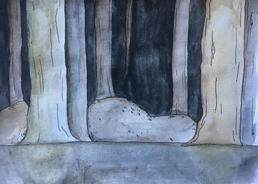
On day 7 I tried to keep things simple as I got into the studio sort of late and had a trip to see Wolfwalkers at the film society planned later on too, so I just animated some magical lights moving around. I wanted it to look sort of fantastical so after animating their shapes in pencil I painted them in blue watercolours and inverted them once in After Effects. I think it made a nice natural feeling to them rather than them being fully filled in digitally. I inserted them into a very John Bauer inspired setting and added a still standing figure and their horse to add to the composition. If I had more time on the day it could have been nice to animate the characters reacting to the light floating over head, or even just adding a boil, but I didn't, so I'm alright with what I produced on the day.

Below are the sketches I worked on before the animation, trying to find what vaguely fantastical thing I could follow up on, then narrowing down to the background and what the figure standing in the centre was going to look like.
Day 8:
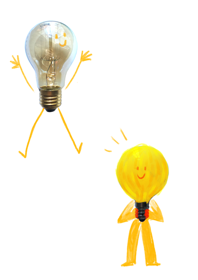
Day 8 was the day that we all made something to promote our exhibition Lightbox. We planned out that we would use the template of the logo and have our lightbulb mascot jump out of the box in the O of 'Lightbox'. The rest was up to the animator, and it was awesome to see how differently everybody interpreted the character and how they made them move. I knew I wanted to make something under the camera and use an actual lightbulb for the base of the mascot. From there I just made him into a little light-up cowboy. I added limbs and a hat with modelling clay and had him jump out of the box, click his heels, and head back in, his hat a little ways behind him. I'm pleased with how his movements came out, he seems pretty charismatic and his proportions make a really fun silhouette. I think the hat could have moved a bit slower at the beginning of its descent but I couldn't do much to change that without redoing a lot of animation of the mascot as I animated it all together except for the little impact that appears around his boots once clicked.
These are some concept sketches from before 10x10 when I was figuring out what I wanted my puppet to look like. I really liked the vibrancy of the last few designs, and I obviously liked giving the guy cowboy boots.
There was a moment in the making process where he could hold himself up if he was balanced perfectly which I found pretty funny, but I had him sit down and relax after his time of screen.
Alistair Brown added some fun music to this which I love!! It's super catchy and fast paced, matching my little lightbulb cowboy very well.
Day 9:
This was the point where the tiredness hit me and I had no idea what I was going to make. I spent most of the day trying to pick something to do, sketching loads of different things to see if they'd stick with me and choosing none of them. I ended up picking up my tablet and making a digital 2D piece, which I hadn't wanted to do again for the rest of 10x10x22 because of my robot film from Day 3, and just doodling on there until something stuck. In the end it was just drawing a scribble that lead me to remember a rally scruffy dog I had seen the other day and decided I was just going to do some simple boils on dogs I had seen about. I actually really like this animation even though I had a pretty rough day getting anywhere with it, it's just silly which I think I needed. It was the penultimate day last year that I made the cat in a car animation, so maybe day 9 is always just a bit of an empty headed silly day.
I would have really liked some cute music to this but as not much is going on in it I don't blame the composers for not making anything, today I went through the dropbox folders to find something that could fit and found a piece by Enya Liao from day 9 that had the right vibe, it even had some sounds that stopped on the cat and then started up again on the next dog, which I think is extra good! I haven't upload this one to the Vimeo as it's a bit late to add anything now so it's just up on my youtube channel as an unlisted video, so only those who have the link can watch it, which for the most part is people looking at this blog. I've also let Enya know that that's how I've done it so they know where their work is being shown.
Day 10:
I was still pretty burnt out on the last day and had another struggle with chosing what to do. I couldn't think of anything for the prompt 'what would you take with you', so I I chose to do my own thing as it was an optional prompt. I wanted to make something magical feeling so took inspiration from an old concept sketch I did for the Beano project last semester and made a scene with a sleeping dragon protecting a kid from the rain with their wing. I then updated it into a mock paper cut-out style in Photoshop, as using this style had been on my mind since responding to Pruzhanskiy's Alice in Wonderland. It looks very storybook and cozy, even if the animation is not particularly grand.
I sketched out quite a few different ideas on the last day, always to a magical theme, had wanted to work on something in clay originally too, so played around with what I could potentially make with the clay I had in the studio but didn't really like anything I made then.

This is the concept art that I based my animation off, I changed a couple things - the style, took away the spine ridges, and made the child more gender neutral.
I uploaded this but then realised it felt empty without any sound, so added some rain effects from freesound.org and an old piece of music by Alessandra Kreig. I didn't actually realise I'd chosen an old piece from last year until I uploaded it but I think it fits so perfectly, it feels calm and magical, which is what I imagine sleeping curled up with a big dragon would be like.
10x10x22 was rewarding and exhausting, much like it was last year. It's going to be hard to get my head back into gear with the rest of my work, especially since it was later this year, but I'm obviously still glad I took part in it and managed to get all of my films uploaded on each day. I definitely want to use mediums like claymation again, and keep trying to add some fantasy elements to things.
My favourite films from the past two weeks are probably my claymation on day 4, and my wolf cowboy on day 6. The style for both of them turned out working really well with what they were portraying and I enjoyed making them a lot. I also think the dogs I've seen lately on day 9 is fun too, and the engagement it got on the facebook group made me really smile.

Now I just need to get back into making silicon bear heads, scripts for robot puppets, and poster designs for the rest of the course!


Comments